API Reference
Constructor Options
| Option | Type | Default | Description |
|---|---|---|---|
container | string \| Element | required | CSS selector or DOM element |
fetchMeta | async (state?) => GridMeta | one of these four required | Returns total row count and column list. Used together with fetchData |
fetchData | async (page, size, state?) => GridData | one of these four required | Returns a page of row data. Used together with fetchMeta |
fetchPage | async (page, size, state?) => GridData & { totalRows, columns? } | one of these four required | Single-callback alternative to fetchMeta+fetchData for a backend that returns both together: see fetchPage |
data | object[] | one of these four required | In-memory array, a convenience alternative to fetchMeta/fetchData/fetchPage, see Local Array Data |
width | number | 1200 | Grid width in CSS pixels |
height | number | 700 | Grid height in CSS pixels |
rowHeight | number | 28 | Row height in CSS pixels |
colWidth | number | 130 | Column width in CSS pixels |
headerHeight | number | 30 | Header row height in CSS pixels |
wrapHeader | boolean | false | When true, header labels wrap onto multiple lines instead of being ellipsis-clipped |
hoverFadeMs | number | 110 | Fade duration (ms) for the row-hover highlight’s entrance/exit. 0 = instant. Forced to 0 under prefers-reduced-motion: reduce |
selectionMoveMs | number | 90 | Travel time (ms) for the selection box moving to a new cell/range. Snaps instead of easing during an active drag. 0 disables it |
scrollEaseMs | number | 120 | Glide length (ms) for mouse-wheel scrolling. Sub-row deltas (precision trackpads) are applied immediately regardless |
columnSlideMs | number | 220 | Travel time (ms) for columns displaced by a column-header drag-reorder. 0 puts them straight into place |
scrollbarSize | number | 12 | Scrollbar thickness in CSS pixels |
chunkSize | number | 300 | Rows fetched per API request |
maxCachedChunks | number | 50 | Maximum number of chunks kept in memory (LRU) |
pagination | { enabled, pageSize? } | undefined | When set, switches from continuous virtual scrolling to classic paging (fixed-size pages + a pager bar at the bottom). pageSize defaults to 50 when omitted, and takes priority over chunkSize when set |
onPageChange | Function | undefined | Page-change callback (page, pageCount) => void, fired only when the page actually changes |
frozenCols | number | 0 | Number of columns frozen from the left. Frozen columns always stay visible during horizontal scroll |
frozenColsRight | number | 0 | Number of columns frozen from the right |
editableCols | string[] \| '*' | [] | List of editable columns. All columns are readonly if omitted; '*' makes all columns editable |
deleteMode | 'mark' \| 'permanent' | 'mark' | What deleteRow() does to a server row when the call doesn’t say: 'mark' dims it with a strikethrough and keeps it on screen (reported by getDeletedRows()); 'permanent' removes it from the screen immediately (reported by getRemovedRows()). Either way the server itself is untouched; the grid only records the choice. deleteRow(i, { permanent }) overrides this per call |
rowContextMenuItems | false \| string[] | undefined (all shown) | Narrows which items appear in the row-number gutter’s right-click menu. false disables it entirely; an array keeps only the named keys: 'row-insert-above', 'row-insert-below', 'row-insert-top', 'row-insert-bottom', 'row-delete' (the last one covers mark/permanent/undelete together, since which renders is row state, not a host choice) |
colContextMenuItems | false \| string[] | undefined (all shown) | Narrows which items appear in the column header’s right-click menu. Same shape as rowContextMenuItems. Valid keys: 'freeze', 'freeze-right', 'visibility', 'insert-left', 'insert-right', 'delete' |
cellContextMenuItems | false \| string[] | undefined (all shown) | Narrows which items appear in the plain-cell right-click menu. Valid keys: 'col-insert-left', 'col-insert-right', 'col-delete', 'row-insert-below', 'row-delete' |
cellContextMenuExtraItems | (ctx) => {label, onClick, disabled?}[] \| null | undefined | Adds custom items to the plain-cell right-click menu, after whichever built-ins cellContextMenuItems left in place. Called fresh every time the menu opens for a cell; ctx carries row/col/field/rowData/clientX/clientY |
columnDefs | ColumnDef[] | undefined | Per-column definitions (type, editor, validation, etc.; see the sections below) |
headerRows | HeaderRowDef[][] | undefined | Explicitly defines multi-level header groups. Takes priority over auto-generation from columnDefs[].group when set |
showRowNumbers | boolean | true | Shows a row-number column on the left. Required for rowReorder |
rowNumberWidth | number | 50 | Width of the row-number column, in pixels |
hiddenColumns | string[] | undefined | Fields to hide on initial render |
responsive | boolean | false | Auto-resizes on container size changes via ResizeObserver (ignored in unsupported browsers) |
onCellChange | Function | undefined | Cell value change callback ({ row, field, newValue, oldValue }) => void |
rowSelection | 'none' \| 'single' \| 'multi' | 'none' | Row selection mode. Rows are selected by click (plus Ctrl/Shift for multi-select) |
onRowSelect | Function | undefined | Callback fired whenever the selected row index array changes (rows: number[]) => void |
rowReorder | boolean | false | Enables dragging rows by the row-number gutter to reorder them. Scans the entire dataset once when enabled |
onRowReorder | Function | undefined | Drag-reorder completion callback (fromIndex, toIndex, rowData) => void |
theme | object | See Theming | Partial theme override |
locale | string | 'en-US' | BCP-47 tag. Sets both the built-in UI text pack (e.g. KO_I18N) and the default locale for CellRenderers.number/date/currency |
i18n | object | undefined | Per-key overrides layered on top of the text pack selected by locale |
ariaLabel | string | undefined | aria-label of the grid container (defaults to i18n.ariaGrid if omitted) |
rowHighlighter | (rowData, rowIndex) => string \| null | undefined | Callback that conditionally sets a row’s background color. Called on every render |
cellBackground | (rowData, rowIndex, field, colIndex) => string \| null | undefined | Callback that conditionally sets a cell’s background color. Painted above rowHighlighter and below cell content |
cellDecorator | (ctx, args) => void | undefined | Draws directly on the canvas on top of a cell’s content, for a small corner mark, icon, or badge. Called for every visible, loaded cell on every render (ctx is the CanvasRenderingContext2D; args adds field to the usual x/y/w/h/rowIndex/colIndex renderer args). Exceptions are caught and logged, and don’t interrupt rendering |
cellTooltip | (rowData, rowIndex, field, colIndex) => string \| null | undefined | Custom tooltip text shown immediately (no hover delay) while the pointer idles over a cell. Takes priority over the built-in overflow-text tooltip, but a validation error on the cell still wins over this |
onSelectionChange | Function | undefined | Cell/range selection change callback (null = selection cleared) |
onSort | Function | undefined | Sort applied/cleared callback (sorts: {field,dir}[] \| null) => void |
onFilter | Function | undefined | Filter applied/cleared callback (filters) => void |
onColumnReorder | Function | undefined | Column drag-reorder completion callback (columns: string[]) => void |
onColumnResize | Function | undefined | Column width resize (mouse-up) callback (field, width) => void |
onRowHeightResize | Function | undefined | Per-row height drag-resize completion callback from the row-number gutter (rowIndex, height) => void |
onRender | Function | undefined | Callback fired after every render |
onChunkError | Function | undefined | Data chunk load failure callback (err: Error) => void |
onValidationError | Function | undefined | Cell validity change callback (row, field, message: string \| null) => void |
onHeaderCheckboxChange | Function | undefined | Header checkbox click callback (field, checked) => void |
Data Source Interface
fetchMeta
fetchMeta: (state?: GridFilterState | null) => Promise<{
  totalRows: number;   // total number of rows in the dataset (after state's filters, if any)
  columns: string[];   // ordered list of column keys
}>
state is the sort/filter/quick-filter the grid wants applied, the same shape fetchData receives (see below). A fetchMeta that ignores it still works, it just always reports the unfiltered total, which makes the scrollbar/row count wrong the moment a filter or sort is active.
fetchData
fetchData: (page: number, size: number, state?: GridFilterState | null) => Promise<{
  rows: Record<string, unknown>[];  // `size` rows starting at offset page*size, honoring `state`
}>
interface GridFilterState {
  sorts:   { field: string; dir: 'asc' | 'desc' }[];
  // string = substring match (setFilter()); string[] = exact-match checkbox selection (setFilterValues())
  filters: Record<string, string | string[]>;
  quickFilter: string; // '' when inactive
}
JHGrid never filters or sorts data itself; it only tracks what the user asked for (which column, which values, which direction) and hands that to fetchMeta/fetchData as state on every call. Applying it (a WHERE/ORDER BY on a real backend, or an Array.filter/sort for an in-memory source) is entirely the host’s responsibility; a callback that ignores state simply never filters or sorts.
Row objects must use the same keys as the columns array returned by fetchMeta.
// fetchMeta → { "columns": ["name", "age", "city"] }
// fetchData → { "rows": [{ "name": "Alice", "age": 30, "city": "Seoul" }] }
fetchPage: single-callback alternative
For a backend that already returns a page of rows and the total count together in one round trip (e.g. a SQL COUNT(*) OVER() alongside the paged query), fetchPage collapses fetchMeta+fetchData into a single callback instead of two:
fetchPage: (page: number, size: number, state?: GridFilterState | null) =>
  Promise<{
    rows: Record<string, unknown>[];
    totalRows: number;
    columns?: string[]; // only needed if not already provided via columnDefs
  }>
const grid = new JHGrid({
  container: '#grid',
  columnDefs: [{ field: 'id' }, { field: 'name' }, { field: 'dept' }],
  fetchPage: (page, size, state) =>
    fetch('/api/grid', {
      method: 'POST',
      headers: { 'Content-Type': 'application/json' },
      body: JSON.stringify({ page, size, state }),
    }).then(res => res.json()), // { rows, totalRows }
});
The grid still asks for chunk 0 once at boot even though it needs both the row count and the rows from that same call, so a plain (page, size) => … implementation isn’t invoked twice for the same page. Only one data source applies: supplying fetchMeta/fetchData alongside fetchPage leaves those two in charge and fetchPage is ignored.
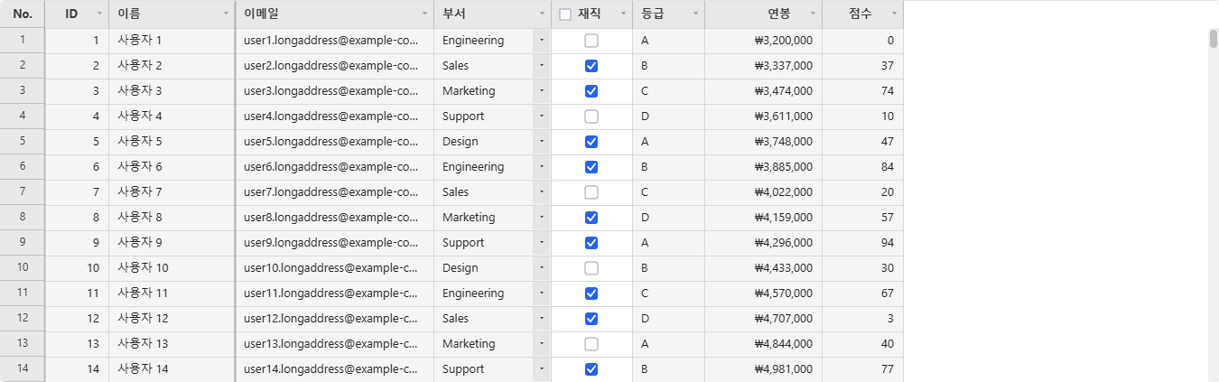
Local Array Data (data)
For a dataset that already fits in memory (prototyping, a small/medium lookup table, tests) pass a plain array via data instead of writing fetchMeta/fetchData yourself. Columns are inferred from columnDefs if given, else from the keys of data[0].
const grid = new JHGrid({
  container: '#my-grid',
  data: [
    { name: 'Alice', age: 30, city: 'Seoul' },
    { name: 'Bob',   age: 25, city: 'Busan' },
  ],
  editableCols: '*',
});
Filtering, sorting, and the quick filter are applied against the array directly (same semantics a server-backed fetchMeta/fetchData is expected to implement; see onFilter/onSort). This re-scans the whole array on every state change with no indexing, so it’s meant for small/medium datasets; a large dataset still belongs behind fetchMeta/fetchData against a real, indexed backend. refresh() re-reads the same array reference, so mutating it externally and calling refresh() picks up the change.
Ignored if fetchMeta/fetchData is also provided.
Pagination
The default is continuous virtual scrolling, but setting the pagination option switches to a classic page-based UI. Each page shows exactly pageSize rows, and scrolling only happens within that page; moving to the next/previous page only happens via the auto-rendered pager bar at the bottom («, ‹, page numbers, ›, ») or via goToPage()/nextPage()/prevPage().
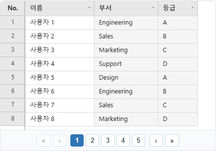
const grid = new JHGrid({
  container: '#grid',
  fetchMeta, fetchData,
  pagination: { enabled: true, pageSize: 50 },
  onPageChange: (page, pageCount) => console.log(`${page + 1} / ${pageCount}`),
});

grid.nextPage();
grid.goToPage(3);
grid.getCurrentPage(); // 0-based
grid.getPageCount();
Every public API that deals with row indices (getEdits(), onCellChange, etc.) always uses absolute indices relative to the entire dataset, regardless of pagination. Pagination only limits what’s scrolled/visible at once, it never changes how rows are addressed.
pageSize is fixed at construction time and cannot be changed at runtime.
Column Definition Reference
Every entry in columnDefs is one ColumnDef. Most fields are covered by their own section further down (type/editor under Column Types, validation under isValid()/getInvalidCells()/validateAll(), button under Button Columns, headerCheckbox under Row Selection, group under Multi-Level Header Groups); this table is the complete field list in one place.
| Field | Type | Description |
|---|---|---|
field | string | Required. The data key this column reads/writes |
label | string | Header text. Defaults to field |
align | 'left' \| 'center' \| 'right' | Cell content alignment |
headerAlign | 'left' \| 'center' \| 'right' | Header label alignment. Defaults to align when omitted |
width | number | Column width in CSS pixels. Falls back to opts.colWidth |
group | string \| string[] | Group-header path (outermost → innermost). See Multi-Level Header Groups |
type | 'text' \| 'dropdown' \| 'multiselect' \| 'checkbox' \| 'button' \| 'date' \| 'image' | Selects the built-in editor + renderer pair. Defaults to 'text' |
renderer | string \| (ctx, args) => void | A CellRenderers key, or a custom draw function. Overrides the renderer type would otherwise select |
editor | string \| (ctx) => {value, remove} | A CellEditors key, or a custom editor factory. Overrides the editor type would otherwise select |
editorOptions | object | Options forwarded to the named CellEditors factory when editor is a string key |
format | string | Date format for type: 'date' columns (e.g. 'YYYY-MM-DD'). Applied to both rendering and clipboard copy |
options | DropdownOption[] \| (rowData) => DropdownOption[] | Option list for type: 'dropdown'/'multiselect': a string array, {value,label} array, or a function computing options per row |
editable | boolean | Per-column override of opts.editableCols. Only meaningful to make a column excluded by editableCols editable anyway, or vice versa |
validation | ColumnValidation | Declarative required/pattern/min/max/length/custom rules: see validation |
button | ButtonColumnDef | Button config for type: 'button': see Button Columns |
headerCheckbox | boolean | Draws a select-all checkbox in this column’s header: see Row Selection |
aggregate | 'sum' \| 'avg' \| 'count' \| 'min' \| 'max' \| {fn, format?} | Aggregate function shown in a group-header row/footer. Built-in types cast with Number(row[field]) and ignore NaN ('count' counts non-null values instead); a custom fn(rows, field) computes the value itself, and format(value) controls the display string. Only meaningful with a row-grouping plugin installed: without one the value is retained but never drawn anywhere |
Public Methods
refresh()
Resets scroll position, clears edits, and reloads data.
grid.refresh();
repaint()
Schedules a redraw without touching data, scroll position, edits, filters, or sort, for when something a cellBackground/rowHighlighter/cellDecorator callback reads changed outside the grid (some other host state) and the next frame needs to reflect it. Much cheaper than refresh() when the underlying data hasn’t actually changed.
someExternalFlag = true;
grid.repaint(); // cellBackground etc. re-evaluate on the next frame
scrollTo(rowIndex)
Scrolls to the specified row. If pagination is enabled, first switches to the page that row belongs to.
grid.scrollTo(5000);
goToPage(page) / nextPage() / prevPage()
Only works when the pagination option is enabled. goToPage() clamps the value to a valid page range.
grid.goToPage(2);
grid.nextPage();
grid.prevPage();
getCurrentPage() / getPageCount()
Returns the current 0-based page number and the total page count. Returns 0 and 1, respectively, when pagination is disabled.
getEdits()
Returns the cell values the user has edited. Use this when saving/sending to the server.
const edits = grid.getEdits();
// { 42: { name: 'New Name' }, 100: { age: '25' } }
await fetch('/api/save', { method: 'POST', body: JSON.stringify(edits) });
clearEdits()
Clears all edits (restores the original data).
grid.clearEdits();
setCellValue(row, field, value)
Programmatically sets a cell value, going through the same edit/validation/undo/onCellChange path as a normal edit (checkbox toggle, paste, fill). Useful when one column’s value needs to be updated from another column (e.g. a button column toggling a checkbox column’s value). Throws if row is not a non-negative integer, if field/value is not a string, or if field is not an existing column.
grid.setCellValue(3, 'active', 'false'); // sets row 3's 'active' column to 'false'
setCellValues(entries)
Bulk counterpart to setCellValue(), applies every entry through the same edit/validation/undo pipeline as a single edit/undo step and one redraw, instead of one redraw per cell. Use this for large-scale updates (e.g. a header checkbox toggling every currently-filtered row) where looping setCellValue() would redraw once per row. Throws under the same conditions as setCellValue().
grid.setCellValues([
  { row: 0, field: 'active', value: 'true' },
  { row: 1, field: 'active', value: 'true' },
  { row: 2, field: 'active', value: 'true' },
]);
Performance note: even batched, this still runs the full edit/validation pipeline once per entry. Applying it to a very large number of rows at once (hundreds of thousands or more) can take a long time and block the main thread while it runs; see the performance note under
Deletefor a concrete measurement of the same underlying cost at that scale.
undo() / redo()
Undoes or redoes the most recent action (cell edit, paste/fill, row/column add/delete, column hide/show/resize/reorder/auto-fit, setState()). Also works via Ctrl+Z (undo) / Ctrl+Y or Ctrl+Shift+Z (redo). Use canUndo() / canRedo() to check availability. Applying a sort/filter (setFilter/setSort/clearFilters, etc.) or calling refresh() re-arranges row indices, so the undo/redo history is automatically cleared.
grid.undo();
grid.redo();
if (grid.canUndo()) { /* ... */ }
isValid() / getInvalidCells() / validateAll()
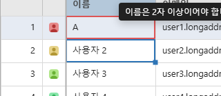
Checks for violations of a column’s declared validation rules. Automatically checked whenever an edit is committed, and shown with a red border (plus an error-message tooltip on hover). validateAll() is meant for a one-shot bulk check before saving, and, like autoFitColumns()/ printGrid(), only checks currently loaded (cached) rows.
const grid = new JHGrid({
  container: '#grid',
  fetchMeta, fetchData,
  editableCols: '*',
  columnDefs: [
    { field: 'email', validation: { required: true, pattern: /^\S+@\S+\.\S+$/ } },
    { field: 'age',   validation: { min: 0, max: 120 } },
    { field: 'code',  validation: { validator: (v) => v.startsWith('A') || 'Code must start with A.' } },
  ],
});

saveBtn.addEventListener('click', async () => {
  grid.validateAll();
  if (!grid.isValid()) {
    alert('Please check your input.');
    console.log(grid.getInvalidCells()); // { 3: { email: '...' } }
    return;
  }
  await fetch('/api/save', { method: 'POST', body: JSON.stringify(grid.getEdits()) });
});
Button Columns (type: 'button')
Renders the entire cell as a single clickable button. Activated by mouse click, touch tap, or Space/Enter/F2 after selecting the cell, and always works regardless of editableCols (since it’s an action trigger, not a data edit). Shows a pointer cursor on hover, and clicking it does not draw a cell-selection border (since it’s an action target, not a selected data cell). label/disabled/ variant all support either a fixed value or a (rowData, rowIndex) => value function; if the label function returns null/'', no button is drawn for that row.
Use setCellValue() alongside an action that actually changes another column’s value (e.g. toggling active/inactive); the example below toggles the active checkbox column via a button, and the button’s own label/color update immediately based on that value.
const grid = new JHGrid({
  container: '#grid',
  fetchMeta, fetchData,
  columnDefs: [
    { field: 'active', label: 'Active', type: 'checkbox' },
    {
      field: 'actions', label: 'Actions', width: 90,
      type: 'button',
      button: {
        label:   (row) => row?.active === 'false' ? 'Activate' : 'Deactivate',
        variant: (row) => row?.active === 'false' ? 'success' : 'danger',
        onClick(rowIndex, rowData) {
          const wasActive = rowData?.active !== 'false';
          grid.setCellValue(rowIndex, 'active', wasActive ? 'false' : 'true');
        },
      },
    },
  ],
});
Row Selection (rowSelection) / Header Checkbox
Setting rowSelection: 'single' | 'multi' lets you select rows by clicking the row-number cell (or Ctrl/Shift for multi-select). onRowSelect(rows) is called whenever the selection changes, and getSelectedRows() returns the currently selected row indices at any time.
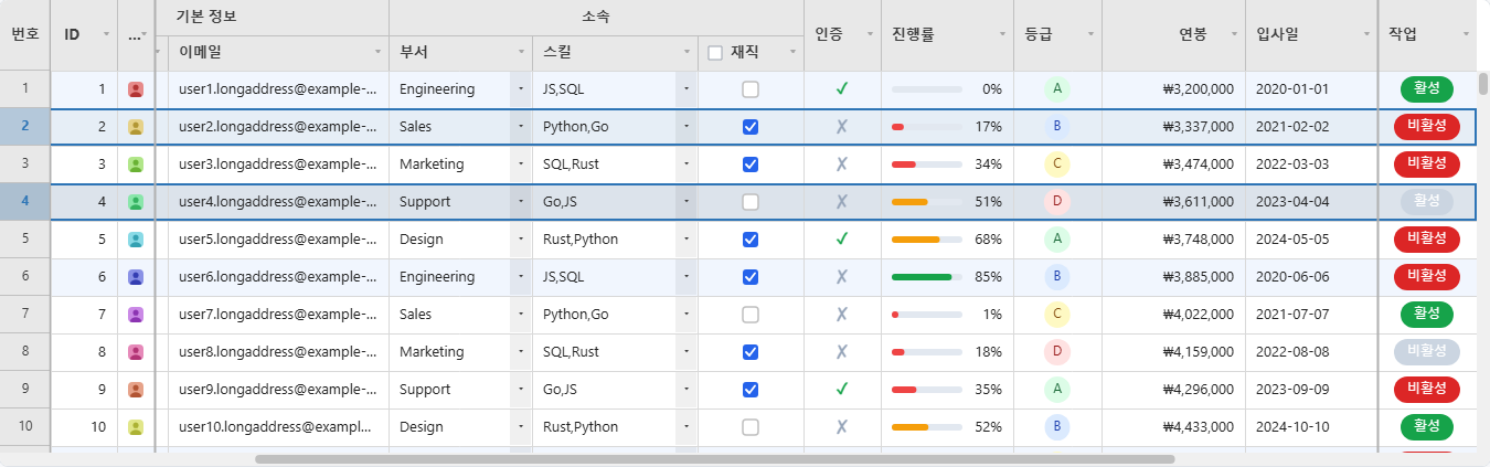
const grid = new JHGrid({
  container: '#grid',
  fetchMeta, fetchData,
  rowSelection: 'multi',
  onRowSelect: (rows) => console.log('selected:', rows),
  columnDefs: [
    { field: 'name', label: 'Name', headerCheckbox: true },
    { field: 'age',  label: 'Age' },
  ],
});

grid.getSelectedRows();   // [2, 5, 9]
grid.clearRowSelection();
Setting columnDefs[i].headerCheckbox: true draws a select-all checkbox in that column’s header, and clicking it calls onHeaderCheckboxChange(field, checked). You can also read/write the state directly in code with setHeaderCheckbox(field, checked) / getHeaderCheckbox(field).
Set Filter / Quick Filter
Filters by a checkbox list of a column’s distinct values in the header filter panel (based on currently loaded rows, capped at 200 (automatically falls back to plain text search above that).
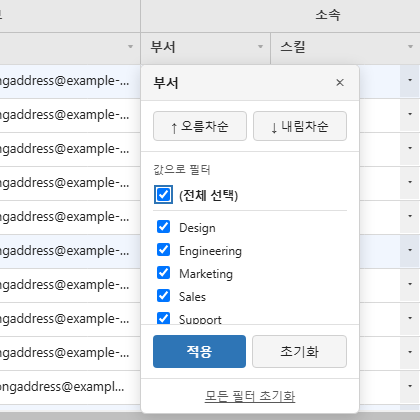
grid.setFilterValues('status', ['active', 'pending']);
grid.setFilterValues('status', null); // clears the filter
Tag Filter (fetchFilterValues)
Above that 200-value cap the panel falls back to a plain substring box, because the column’s values could not be enumerated from the rows in memory. Give it a way to look them up and that box becomes a tag picker instead: the user types, picks from what the lookup returns, and each pick becomes a chip. Chips are combined with OR and applied as a string[], the same shape the checklist already sends, so fetchData, getState(), and onFilter need no changes.
new JHGrid({
  // …
  // Called as the user types, debounced. Bound it server-side where you can (LIMIT).
  fetchFilterValues: async (field, query) =>
    fetch(`/api/distinct?col=${field}&q=${encodeURIComponent(query)}&limit=50`).then(r => r.json()),
});
The lookup is debounced and waits for two characters (filterValueMinChars). A single character against a large column is the most expensive query this control can issue and the least selective answer it can get; below the threshold the panel says so and still offers the substring fallback, which needs no lookup at all. Set it to 1 for the pre-existing behaviour.
Return however many matched; the panel builds at most 50 rows regardless and reports the rest as “+N more, narrow the search”. A one-letter query against a large column would otherwise mean thousands of DOM nodes built on every keystroke, which is a freeze rather than a long list, and no 220px dropdown can show them anyway. A LIMIT on your side still saves the transfer.
Picking a value drops it into the tray, clears the box and leaves the caret there, so the next value starts with a fresh search. The list keeps the same height whether or not any chips have been collected yet; it is the tray below that gives way when the panel runs short of room, since chips are what you already chose rather than what you are reading.
A column that was once too large to enumerate keeps its search box for the life of the grid. The value scan only sees loaded rows, so a filter narrows them, and without this a column filtered down to a handful of rows would look small enough for a checklist and swap the control out from under whoever had just used the search to filter it.
Columns small enough to enumerate keep their checklist, which is more precise than searching. Omit fetchFilterValues and nothing changes anywhere.
If the typed text matches nothing the lookup knows about, the list still offers a contains “…” entry that falls back to today’s substring filter and arrives as a plain string. A column carries exact values or a substring, never both; the filter map holds one value per field and the two mean different things, so picking the fallback clears the tags and shows its own dashed chip.
Chips wrap and then scroll rather than growing the panel off-screen, and a value too long for the panel is ellipsized with the full text in its title. Nothing is applied until Apply: filtering is a server round trip, and committing per chip would cost one request per tag.
A global search term across all columns is handled via the quick filter. JHGrid doesn’t render its own toolbar, so build the search box UI in the host page and pass the value through this API.
searchInput.addEventListener('input', (e) => grid.setQuickFilter(e.target.value));
grid.getQuickFilter();
grid.clearQuickFilter();
Field-Based Filter / Sort (setFilter / setSort)
Separately from setFilterValues() (the Set filter UI), you can also set an arbitrary filter condition on a single field directly from code. Sorting is always single-column.
grid.setFilter('status', 'active');   // only show rows where 'status' equals 'active'
grid.removeFilter('status');          // clear just that field's filter
grid.clearFilters();                  // clear all filters

grid.setSort('age', 'desc');          // sort by 'age' descending (replaces any existing sort)
grid.removeSort('age');
grid.clearSort();
Adding/Deleting Rows (addRow / deleteRow)
grid.addRow({ name: 'New', age: 0 });        // append at the end
grid.addRow({ name: 'New' }, { index: 0 });  // insert at the front

grid.deleteRow(3);      // marks row 3 as deleted (strikethrough, undoable)
grid.undeleteRow(3);    // clears the deletion mark

grid.getNewRows();      // rows added this session, use this to send new-insert requests to the server
grid.getDeletedRows();  // server indices of rows marked for deletion (see the note below)
By default deleteRow() marks a server row (dims it with a strikethrough, keeps it on screen, and reports it via getDeletedRows()) rather than removing it; this is the deleteMode constructor option, 'mark' by default. Pass { permanent: true } (or set deleteMode: 'permanent' for the whole grid) to take the row off the screen immediately instead:
grid.deleteRow(3, { permanent: true }); // removed from the screen right away
grid.getRemovedRows(); // server indices removed this way, separate from getDeletedRows()
grid.undeleteRow(3);   // brings a permanently-removed row back too
A row added via addRow() ignores all of this; it was never sent anywhere, so deleteRow() on it just removes it outright regardless of deleteMode.
getDeletedRows()/getRemovedRows() report server indices, not screen positions: a row inserted above a marked one moves it down the screen, but not in what these two report.
Adding/Deleting/Hiding Columns (addColumn / deleteColumn / hideColumn)
grid.addColumn('email', { label: 'Email' });
grid.deleteColumn('email');
grid.undeleteColumn('email');
grid.getNewColumns();
grid.getDeletedColumns();
grid.commitColumns(['email']); // finalizes the add/delete marks (no longer undoable)

grid.hideColumn('age');
grid.showColumn('age');
grid.isColumnVisible('age');   // boolean
grid.getHiddenColumns();       // string[]
Row Height (setRowHeight / autoFitColumns)
grid.setRowHeight(3, 40);   // changes only row 3's height to 40px
grid.setRowHeight(28);      // called with one argument, changes the default row height for all rows
grid.getRowHeight(3);
grid.resetRowHeight(3);     // resets that row back to the default height

grid.autoFitColumns('name', 'age'); // auto-resizes the given columns to fit their content (all columns if no argument)
Like isValid()/printGrid(), autoFitColumns() only computes against currently loaded (cached) rows.
State Snapshot/Restore (getState / setState)
Extracts the grid’s current state (filters, sort, column order/visibility, edits, etc.) as a serializable object, and can restore it later exactly as it was (e.g. saving a per-user view).
const state = grid.getState();
localStorage.setItem('gridState', JSON.stringify(state));

grid.setState(JSON.parse(localStorage.getItem('gridState')));
A setState() call is recorded as a single undoable action. setState() returns a Promise that resolves once the grid is actually showing that state; if the snapshot carries sorts, filters, or quickFilter, those only describe what the server should return, so the grid re-fetches and the promise waits for the answer. A snapshot that only moves columns around resolves immediately, since there’s nothing to ask for. Unknown fields are ignored, so a snapshot taken with an older version of the grid still applies as far as it goes.
GridState’s fields:
| Field | Type | Description |
|---|---|---|
columns | string[] | Current visible column order |
columnWidths | Record<string, number> | Current width of every column, by field |
hiddenColumns | string[] | Currently hidden fields |
frozenCols / frozenColsRight | number | Current frozen-column counts |
sorts | {field, dir}[] | Active sort(s) |
filters | Record<string, string \| string[]> | Active per-column filters: string (substring match) or string[] (Set filter) |
quickFilter | string | Active quick-filter term, '' when inactive |
selectedRows | number[] | Currently selected row indices (rowSelection mode) |
headerCheckboxState | Record<string, boolean> | Checked state of every headerCheckbox column’s header checkbox |
localColumns | ColumnDef[] | Columns added via addColumn() not yet committed (see getNewColumns()/commitColumns()) |
deletedColumns | string[] | Server columns marked deleted via deleteColumn(), not yet committed (see getDeletedColumns()) |
rowChanges | object | Unsaved row work: see below |
grouping / treeData / colorFilters | varies | Always present (as null when unused) even without the plugin that gives them meaning; a plain getState()/setState() round-trip preserves them regardless. Only a row-grouping/tree-data/color-filter plugin actually reads or writes them |
rowChanges is the row counterpart of localColumns/deletedColumns, keyed by server index throughout (never screen position, since a snapshot is meant to outlive whatever arrangement produced it):
rowChanges field | Type | Description |
|---|---|---|
added | {anchor, data, edits}[] | Rows from addRow(). anchor is the server index the row sits in front of (equal to the row count when appended at the end) |
removed | number[] | Server indices removed via deleteRow(i, { permanent: true }): see getRemovedRows() |
marked | number[] | Server indices marked for deletion: see getDeletedRows() |
edits | Record<number, Record<string, string>> | Unsaved cell edits on server rows, serverIndex -> field -> value |
setState() treats rowChanges as a full replacement, not an addition; restoring the same snapshot twice doesn’t duplicate rows. Restoring against changed server data names different records by index, the same caveat that applies to filters naming fields that may no longer exist.
getRowData(rowIndex) / ready()
grid.getRowData(3);  // row 3's current data (with unsaved edits applied; null if not loaded)
await grid.ready();  // waits until the initial metadata/first chunk load completes
Incremental Save (getOriginalRowData / isNewRow / acknowledgeSave / acknowledgeInsert)
For a host that saves as the user goes (auto-save on commit) rather than in one batch via getEdits(), these let a single row be reconciled with the server without the full reset (scroll position, filters, sort, selection) that refresh() does.
grid.getOriginalRowData(3); // row 3's pre-edit snapshot: what getRowData(3) returned before
                             // any unsaved edits, independent of later addRow()/deleteRow() calls
grid.isNewRow(3);           // true if row 3 came from addRow() and has no server counterpart yet
// A server row the user just edited, saved successfully:
async function saveRow(rowIndex) {
  const saved = await fetch('/api/rows/' + rowIndex, {
    method: 'PUT',
    body: JSON.stringify(grid.getRowData(rowIndex)),
  }).then(r => r.json());
  grid.acknowledgeSave(rowIndex, saved); // patches the cache, drops the pending edit
}

// A row added via addRow(), just created on the server:
async function createRow(rowIndex) {
  const created = await fetch('/api/rows', {
    method: 'POST',
    body: JSON.stringify(grid.getRowData(rowIndex)),
  }).then(r => r.json());
  grid.acknowledgeInsert(rowIndex, created); // turns it into an ordinary server row in place
}
acknowledgeSave() is a no-op if isNewRow(rowIndex) is true (a brand-new row has no server slot yet to patch; use acknowledgeInsert() for that case instead, which returns false if rowIndex wasn’t actually a local/unsaved row).
Multi-Level Header Groups (columnDefs[].group)
Consecutive columns sharing the same label at a given level are automatically merged into a single header group cell.
columnDefs: [
  { field: 'q1_score', label: 'Q1', group: 'Quantitative' },
  { field: 'q2_score', label: 'Q2', group: 'Quantitative' },
  { field: 'review',   label: 'Comments', group: 'Qualitative' },
],
For finer control, define header rows explicitly with the headerRows option instead of columnDefs[].group. headerRows is HeaderRowDef[][]: an array of header rows, each an array of group cells for that row:
headerRows: [
  [ // top row
    { label: 'Quantitative', fields: ['q1_score', 'q2_score'] },
    { label: 'Qualitative',  fields: ['review'] },
  ],
],
columnDefs: [
  { field: 'q1_score', label: 'Q1' },
  { field: 'q2_score', label: 'Q2' },
  { field: 'review',   label: 'Comments' },
],
HeaderRowDef field | Type | Description |
|---|---|---|
label | string | The group cell’s text |
fields | string[] | Field names this group spans. Recomputed automatically after a column reorder, so it always tracks the current column order rather than a fixed position |
colspan | number | Explicit column span, if it shouldn’t be inferred from fields.length |
rowspan | number | How many header rows tall the cell is (for a group with no further subdivision below it) |
align | 'left' \| 'center' \| 'right' | Group cell text alignment |
Locale / Internationalization (locale / i18n)
Setting locale switches both the built-in UI text pack (currently Korean/Japanese/Simplified Chinese are bundled) and the default locale for the number/date/currency cell renderers. Use i18n to override specific strings on top of that.
import { JHGrid, KO_I18N } from '../dist/jhgrid.esm.js';

const grid = new JHGrid({
  container: '#grid',
  fetchMeta, fetchData,
  locale: 'ko',                 // or 'ko-KR' (defaults to 'en-US')
  i18n: { ...KO_I18N, loading: 'Loading…' }, // override specific strings only
});
Conditional Styling (rowHighlighter / cellBackground)
const grid = new JHGrid({
  container: '#grid',
  fetchMeta, fetchData,
  rowHighlighter: (row) => row?.status === 'ERROR' ? 'rgba(239,68,68,0.12)' : null,
  cellBackground: (row, rowIndex, field) =>
    row && field === 'score' && row.score < 60 ? '#fee2e2' : null,
});
Both callbacks are called on every render (for visible rows/cells), so keep them lightweight; exceptions thrown in cellBackground are logged and ignored, and don’t block rendering.
Row Drag Reorder (rowReorder)
Drag rows by the row-number gutter to reorder them. Unlike column reordering, row data isn’t always resident in memory under server-side paging, so enabling this scans the entire dataset once (it’s an opt-in feature).
const grid = new JHGrid({
  container: '#grid',
  fetchMeta, fetchData,
  rowReorder: true,
  onRowReorder: (fromIndex, toIndex, rowData) => console.log(fromIndex, '→', toIndex),
});
Built-in Cell Renderers (CellRenderers)
Assign any of these to columnDefs[i].renderer (either the string key or a call to the factory directly; both are equivalent, but calling it yourself lets you pass options):
import { CellRenderers } from '../dist/jhgrid.esm.js';

columnDefs: [
  { field: 'progress', renderer: CellRenderers.progressBar({ max: 100, showLabel: true }) },
  { field: 'grade',    renderer: CellRenderers.badge({ colorMap: { A: { bg: '#dcfce7', fg: '#166534' } } }) },
]
| Renderer | Options | Description |
|---|---|---|
progressBar({ max?, showLabel? }) | max (default 100), showLabel (default false) | A filled bar sized to value / max, with an optional percentage label |
badge({ colorMap? }) | colorMap: Record<value, {bg?, fg?}> | A pill-shaped tag per distinct value, colored per colorMap (falls back to a neutral gray for values not listed) |
checkmark({ trueColor?, falseColor?, showFalse? }) | colors + whether to draw anything for a false-y value | A ✓/✗ glyph instead of raw 'true'/'false' text |
image({ fit?, radius? }) | fit: 'cover' \| 'contain' (default 'cover'), radius (corner radius, px) | Renders the cell value as an image URL: see the type: 'image' note below for caching/decoding details |
number({ locale?, decimals? }) | BCP-47 locale, fixed decimals | Intl.NumberFormat-based number formatting |
date({ format?, locale?, dateStyle?, align? }) | format: a YYYY/MM/DD/HH/mm/ss pattern, or 'locale' to format via Intl.DateTimeFormat | Date formatting: pattern-based by default, locale-aware when format: 'locale' |
currency({ locale?, currency? }) | BCP-47 locale, ISO 4217 currency code | Intl.NumberFormat-based currency formatting |
dropdown({ placeholder? }) | placeholder text for an empty value | Current value + a ▾ arrow, matching the dropdown editor’s affordance |
multiselect({ placeholder? }) | placeholder text for an empty selection | Selected values joined + a ▾ arrow |
checkbox({ checkedColor?, size? }) | box color and size (px) | A checked/unchecked box glyph |
button({ label?, disabled?, variant? }) | same shape as columnDefs[i].button (see Button Columns) | Renders the cell as a clickable button; this is what type: 'button' uses internally |
locale on number/date/currency falls back to theme.locale (set via the top-level locale constructor option) when omitted, so most grids never need to pass it per-column.
Clicking an already-selected dropdown/multiselect cell opens its editor immediately (no double-click needed):
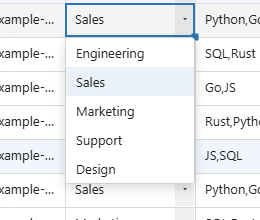
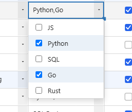
Register your own under a string key with registerCellRenderer(name, factory) (and the editor counterpart, registerCellEditor), see the custom-editor example below for the matching factory shape.
Column Types: date / richtext / image, and Custom Editors/Renderers
columnDefs[i].type supports date/richtext/image in addition to checkbox/dropdown/button. When set, the matching editor (CellEditors) and display renderer (CellRenderers) are applied automatically.
columnDefs: [
  { field: 'dob',    type: 'date', editorOptions: { min: '1900-01-01', max: '2100-12-31' } },
  { field: 'notes',  type: 'richtext' },              // bold/italic/underline/strikethrough
  { field: 'avatar', type: 'image', renderer: 'image', renderOptions: { fit: 'cover' } },
],
-
type: 'date': uses a native<input type="date">editor (ordatetime-localifeditorOptions: { mode: 'datetime-local' }is set) andCellRenderers.date({ format: 'locale' })for display.editorOptions.min/maxare passed straight through as that<input>’smin/maxattributes. Combined withvalidation: { min, max }, values are compared as date strings (not numbers).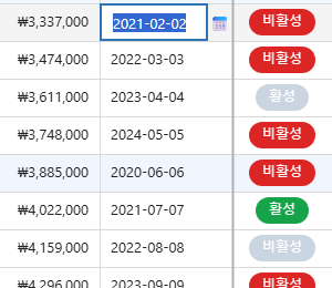
-
type: 'richtext': double-clicking a cell opens acontenteditableeditor with a bold/italic/ underline/strikethrough toolbar. The stored value is a sanitized HTML string made up only of<b>/<i>/<u>/<s>tags, and the grid draws it on the canvas as a single line (line breaks, lists, and block elements aren’t supported, to match the fixed row-height model). This string is copied as-is to CSV/clipboard.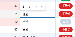
-
type: 'image': interprets the cell value as an image URL and draws it withCellRenderers.image({ fit: 'cover' | 'contain', radius }). Decoding is done viafetch()+createImageBitmap(blob, { resizeWidth, resizeHeight }), sized to fit the cell’s display size, so memory usage stays low regardless of the source resolution, and the same URL is reused across grids via a page-wide LRU cache (50MB budget). Redraws automatically once the async load finishes.
To build your own cell editor, assign a function to columnDefs[i].editor, the same way renderer accepts a function:
{ field: 'color', editor: (ctx) => {
    const input = document.createElement('input');
    input.type = 'color';
    input.value = ctx.initialValue || '#000000';
    Object.assign(input.style, { position: 'absolute', left: ctx.x + 'px', top: ctx.y + 'px' });
    ctx.wrapper.appendChild(input);
    input.addEventListener('change', () => ctx.commit());
    return input; // any shape works as long as it has .value / .remove()
  } }
ctx carries row/col/field/rowData, position/size (x/y/colW/rowH), theme/i18n/ columnLabel, initialValue, and callbacks to notify the host grid: commit()/cancel()/ moveSel(dr, dc)/focusWrapper(). The return value only needs .value (a string) and .remove(), so you can either return an <input> directly (as above) or return an object shaped like CellEditors.dropdown()’s { get value() {...}, remove() {...} }.
You can also register reusable editors/renderers by name, so multiple columns can reference them by string key:
import { registerCellEditor, registerCellRenderer, CellRenderers } from '../dist/jhgrid.esm.js';

registerCellEditor('color', (opts) => (ctx) => { /* same factory shape as above */ });
registerCellRenderer('color', () => (ctx, info) => { /* draw a color swatch on the canvas */ });

columnDefs: [{ field: 'favoriteColor', editor: 'color', renderer: 'color' }]
Data Export (exportCsv / printGrid)
By default, both APIs export only the currently loaded/cached chunks: pass { full: true } to export the entire server-side dataset instead (re-fetches every page while preserving the current filter/sort conditions).
await grid.exportCsv({ filename: 'users.csv', full: true });

grid.printGrid({ title: 'User List' });
destroy()
Fully removes event listeners and DOM. Call this when unmounting a component or navigating away.
grid.destroy();