Theming
Pass a theme object to override any default value:
const grid = new JHGrid({
  container: '#grid',
  fetchMeta,
  fetchData,
  theme: {
    headerBg:       '#1e3a5f',
    headerText:     '#ffffff',
    rowEven:        '#ffffff',
    rowOdd:         '#f0f4ff',
    cellText:       '#111827',
    scrollbarThumb: '#6b7280',
  },
});
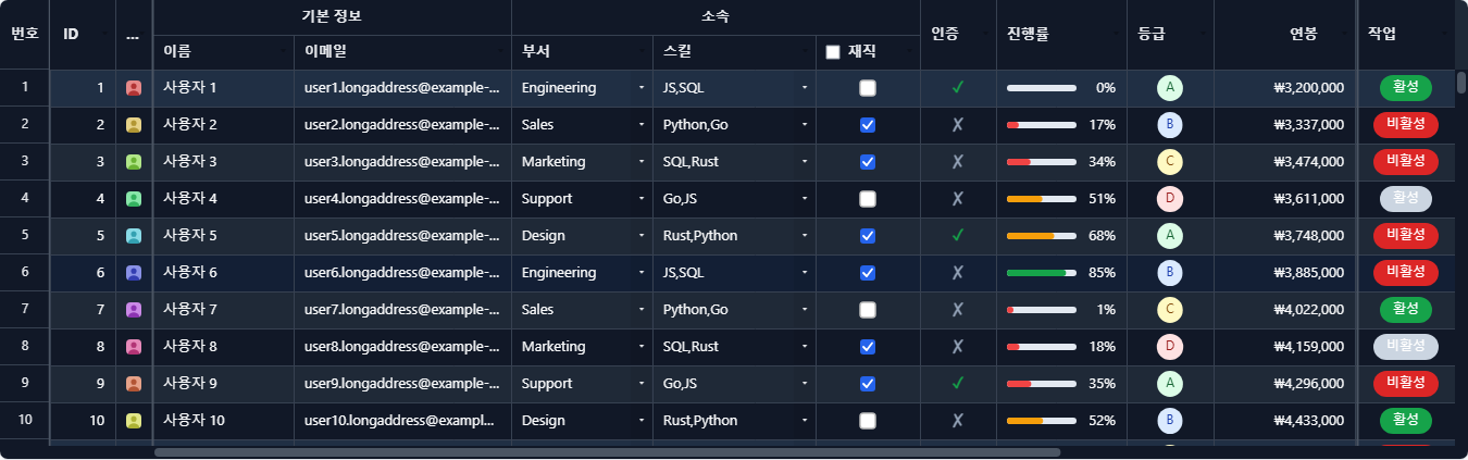
Full Theme Reference
Canvas tokens
Everything below is painted directly on the <canvas>: the grid body, header, selection, scrollbars, and cell state indicators. theme is the only way to set most of them; two (selectionColor, fontFamily) are also bridged to a --jhg-* CSS variable because DOM overlays (the filter panel’s “Apply” button, cell editors) borrow them for visual consistency with the canvas; see the note under the table below.
| Key | Default | Description |
|---|---|---|
headerBg | #E8E8E8 | Header background color |
headerText | #3D3D3D | Header text color |
headerBorder | #C0C0C0 | Header column separator color |
rowEven | #FFFFFF | Even row background |
rowOdd | #FFFFFF | Odd row background |
cellBorder | #D9D9D9 | Cell border color |
cellText | #212121 | Cell text color |
loadingText | #BFBFBF | Text color while chunk is loading |
skeletonBar | #E4E7EB | Bar drawn in a cell whose row hasn’t arrived yet, instead of leaving it blank |
skeletonSheen | rgba(255,255,255,0.65) | The lighter band that sweeps across those skeleton bars. Held still under prefers-reduced-motion: reduce |
cellPadding | 10 | Horizontal padding inside cells (px) |
selectionColor | #2E75B6 | Cell selection / range border color |
selectionFill | rgba(46,117,182,0.10) | Range selection background overlay |
selRowBg | rgba(46,117,182,0.12) | Background overlay for selected rows (when rowSelection is active) |
hoverRowBg | rgba(0,0,0,0.045) | Wash over the row under the pointer. Neutral rather than the selection blue so the two stay tellable apart on the same row; use a light value on a dark theme, or a falsy value to disable |
frozenBorder | #B0B0B0 | Separator line between frozen and scrollable columns |
scrollbarBg | #F0F0F0 | Scrollbar track background |
scrollbarThumb | #C0C0C0 | Scrollbar thumb color |
scrollbarRadius | 4 | Scrollbar thumb border radius (px) |
groupHeaderBg | #EEF2F7 | Multi-level header group cell background |
groupHeaderText | #1E293B | Multi-level header group cell text |
footerBg | #F2F2F2 | Aggregate footer row background |
footerText | #1E293B | Aggregate footer row text |
filterIconBg | rgba(245,158,11,0.18) | Background of the filter icon on a header with an active filter |
filterIconColor | #C87B00 | Filter icon color |
sortIconBg | rgba(46,117,182,0.12) | Background of the sort icon on a header with an active sort |
sortIconColor | #2E75B6 | Sort icon color |
headerIconColor | rgba(0,0,0,0.28) | Color of other header icons (when no filter/sort is applied) |
hiddenColIndicator | #94A3B8 | Border color of the Excel-style double-line drawn on headers adjacent to a hidden column |
editableCellBg | undefined (no tint) | Background tint applied to editable cells when editableCols is not '*' |
readonlyCellBg | #F5F5F5 | Background tint applied to readonly cells when editableCols is not '*' |
imagePlaceholderBg | #F1F5F9 | CellRenderers.image() cell background while an image is loading |
imageErrorBg | #FEE2E2 | CellRenderers.image() cell background on load failure |
imageErrorIcon | #DC2626 | CellRenderers.image() “broken image” X glyph color |
fontSize | 13 | Font size for all text (px) |
headerFontSize | defaults to fontSize | Header cell font size (px) |
fontFamily | -apple-system, BlinkMacSystemFont, "Segoe UI", Roboto, sans-serif | Font family for all text |
locale | 'en-US' | Default BCP-47 tag used by CellRenderers.number/date/currency when a column doesn’t pin its own locale. Not a visual token; this is set via JHGridOptions.locale |
invalidCellBorder | #dc2626 | Outline drawn around a cell whose value fails its column’s validation |
deletedRowFill | rgba(239,68,68,0.10) | Background of a row marked deleted by deleteRow() but not yet committed |
deletedRowStrike | rgba(239,68,68,0.55) | Strikethrough color for text in a row marked deleted |
dragGhostShadow | rgba(15,23,42,0.30) | Drop shadow under the ghost that follows the pointer during a column-header drag |
dragIndicatorFill | rgba(59,130,246,0.12) | Insertion-point fill shown while dragging a column/row to reorder |
dragIndicatorLine | #3b82f6 | Insertion-point line shown while dragging a column/row to reorder |
dragIndicatorFill/dragIndicatorLine/deletedRowFill/deletedRowStrike/ invalidCellBorder are automatically remapped to system colors in high-contrast (forced-colors) mode; visibility in high-contrast mode is preserved even with a custom theme applied.
selectionColor doubles as the DOM overlays’ accent color via --jhg-accent (e.g. the filter panel’s “Apply” button and the sort-direction toggle), and fontFamily is mirrored to --jhg-font-family so overlay text matches the canvas font without being set twice.
DOM surface tokens
These style the parts of the grid that are real DOM rather than canvas: the filter panel, context menus, the column chooser, cell editors, and the pager. theme reaches them the same way as the canvas tokens above, but each is also bridged to a --jhg-* CSS custom property (see Styling with your own CSS below); set the variable in your own stylesheet and it wins over whatever theme says, since every one of these is emitted as var(--jhg-…, <theme value>).
| Key | CSS variable | Default | Description |
|---|---|---|---|
overlayBg | --jhg-overlay-bg | #FFFFFF | Background of panels, menus and dialogs |
overlayBorder | --jhg-overlay-border | #D0D0D0 | Their outer border |
overlayHeaderBg | --jhg-overlay-header-bg | #F5F5F5 | Header strip inside a panel or dialog |
overlayDivider | --jhg-overlay-divider | #E0E0E0 | Hairline between sections of a panel |
overlayText | --jhg-overlay-text | #212121 | Primary text on those surfaces |
overlayMutedText | --jhg-overlay-muted-text | #595959 | Secondary text (labels, counts) |
overlayHintText | --jhg-overlay-hint-text | #909090 | Placeholder and hint text |
overlayHoverBg | --jhg-overlay-hover-bg | #F5F5F5 | Hover background for a row in a list, such as a filter checklist |
overlayItemHoverBg | --jhg-overlay-item-hover-bg | #F0F0F0 | Hover (and keyboard-focus) background for a menu item |
overlayShadow | --jhg-overlay-shadow | 0 4px 16px rgba(0,0,0,0.15) | Shadow under panels and dialogs |
overlayMenuShadow | --jhg-overlay-menu-shadow | 0 4px 12px rgba(0,0,0,0.15) | Shadow under context menus, which sit closer to the surface |
overlayAccentText | --jhg-overlay-accent-text | #FFFFFF | Text on an accent-filled control, such as the filter panel’s apply button |
pagerBg | --jhg-pager-bg | #f8fafc | Pager bar background. Only rendered with pagination enabled |
pagerText | --jhg-pager-text | #1e293b | Pager bar text |
pagerBorder | --jhg-pager-border | #e2e8f0 | Border between the pager bar and the grid |
pagerButtonBg | --jhg-pager-button-bg | #ffffff | Page-button background |
pagerButtonBorder | --jhg-pager-button-border | #cbd5e1 | Page-button border |
Styling with your own CSS
The grid body, header, selection and scrollbars are painted on a <canvas>, so CSS cannot reach them; those are configured through theme above. Everything around the grid is real DOM and can be styled directly.
Each DOM surface carries a stable class, and the theme object is mirrored onto --jhg-* custom properties scoped to the grid. Overriding a variable in your own CSS wins over the built-in value:
.jhg-root, .jhg-pager {
  --jhg-overlay-bg: #1f2937;
  --jhg-overlay-text: #f9fafb;
  --jhg-overlay-border: #374151;
  --jhg-accent: #60a5fa;
}
| Class | Surface |
|---|---|
.jhg-root | Grid wrapper (variable scope) |
.jhg-overlay | Any floating surface; carries the entrance animation |
.jhg-panel | Filter / sort panel |
.jhg-dialog | Column visibility chooser |
.jhg-menu / .jhg-menu-item | Context menus and their rows |
.jhg-btn / .jhg-swatch | Buttons and color swatches inside overlays |
.jhg-pager / .jhg-pager-btn | Pagination bar and its buttons |
.jhg-editor | Cell editors and the filter search input |
.jhg-loading / .jhg-empty / .jhg-tooltip | Loading overlay, empty state, cell tooltip |
These strings are also exported as GRID_CLASSES, for code that wants to target a surface without hardcoding the class name:
import { GRID_CLASSES } from '../dist/jhgrid.esm.js';

document.querySelectorAll(`.${GRID_CLASSES.menuItem}`);
Motion is deliberately restrained (≈140 ms, opacity/transform only) and is disabled automatically under prefers-reduced-motion: reduce. Retime it globally without rewriting rules:
.jhg-root { --jhg-motion-fast: 90ms; --jhg-motion-slow: 120ms; }
Only motion and focus rules live in the injected stylesheet (one <style id="jhgrid-styles"> per document); colors and layout stay inline so a missing stylesheet degrades to “no animation” rather than an unstyled grid.
Canvas motion
The grid body is painted into a <canvas>, so none of the CSS above reaches it. What it does have is a row hover highlight: the row under the pointer takes the hoverRowBg wash, and the highlight fades as it appears and disappears.
The row it sits on moves instantly while only the opacity eases. Fading the movement itself would make the highlight trail the pointer while you scan down a column, which reads as the grid being slow, and would briefly light two rows at once.
The selection box also travels to its new cell or range instead of jumping (selectionMoveMs). It deliberately snaps rather than easing whenever easing would put the border somewhere the user is actively aiming:
- during a range drag or fill drag: the box has to stay under the pointer;
- when the selection appears from nothing or clears;
- when a move arrives before the previous one has landed. Held arrow keys repeat far faster than the box can cross a cell, so the first step eases and the rest are exact.
Dragging a column header lifts its header cell out and carries it under the cursor, and the reorder happens live: as the pointer crosses each boundary the columns it displaces slide aside (columnSlideMs), so the grid previews the arrangement it will actually end up in instead of rearranging on drop. Outside the drag handler it is still one move: onColumnReorder fires once with the final order, one undo step covers the whole drag, and Esc puts the column back.
Mouse-wheel scrolling glides to where the gesture is heading (scrollEaseMs) rather than teleporting a notch at a time. Deltas smaller than one row are applied immediately instead: a precision trackpad emits a dense stream of few-pixel deltas that is already smooth, and easing it would add lag the hardware had already removed. The split is by step size, not by trying to identify the device.
new JHGrid({
  // …
  hoverFadeMs: 0,                                  // instant, no fade
  selectionMoveMs: 0,                              // selection box jumps
  scrollEaseMs: 0,                                 // wheel deltas applied immediately
  theme: { hoverRowBg: 'rgba(255,255,255,0.055)' } // light wash for a dark theme
});
Set theme.hoverRowBg to a falsy value to turn the highlight off entirely; the grid then does no hover tracking or repainting at all. Both durations are forced to 0 under prefers-reduced-motion: reduce, which removes the easing but keeps the highlight and the box.